Friday, 2 November 2012

Alas! There is light!

As part of the concept art team, I have merged the two art styles of Sook Yee and my (Fiona) skybox and created the final piece:

 =

having inspiration from the art style of Shane Devries found on this post by Amberley.
Now the skybox has a crisp clean sky with cartoon-like fluffy clouds.

Cleaning the piece was at first difficult with rendered pieces that were in a different resolution to the template skybox, but after some adjustments and tweaking, lines were smoothed out and merged to look seamless. If Shadow ever continues its development, the skybox can be altered to suit different times of the day by adjusting its hues and saturation quite easily.

Fun times in Shadow's world can now continue, now that there is light!

-Fiona.


Friday, 12 October 2012

Props in game


Firstly, thank you Christina for proofreading and adding content to this post.

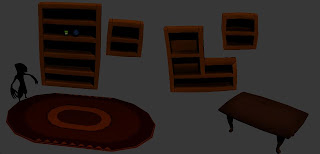
I'm Zac, one of the minor game prop developer as well as part of the animating team. I will be writing up a little bit on the props in our game.

Our props in the game are specially crafted and even though they are small in sizes, they are pretty much a major part of the game, including the gameplay. Even though some of them are not directly intractable, these little things are the ones that give the game a specific feel that we, as developers, want the player to have while making their through the game. In one of the scenes, our props actually almost fill up the entire scene! This is to create a certain type of ambience, in attempt to generate an experience for the player. We want to give a feeling of style and place, as well as character.

So how do we get our props created?

We first decide on the general art style, which is done way early in the project. Next, we have our talented concept artists draw out a couple of concepts for the idea of the specific props we want done. From there it is an easy job of getting the props steamrolled into creation! It’s also important throughout the development that all assets are brought back on track as far as the art style is concerned. Shadow has also made use of reoccurring shapes in the creation of assets. Can you spot any of them?

Monday, 1 October 2012

User Test

Hey all,

I have not posted in awhile, but thought i would update you with our user testing methods.

Our users test will be coming up soon and we will be using three different methods to test our game, these methods will give us the best results and find our sneaky hidden problems the quickest out of all user test methods.

Method A,
Observation

A simple method, in which a user conductor will observe the game while it is being played by a player. This method is mainly to find any unwanted bugs in the game but also allows us to see the players expressions during the game; if they are angry, frustrated or happy and excited.  We can monitor all of this to allow us to work out what stages are working with the player without breaking their immersion.

Method B,
Questionnaire

 The questionnaire is mainly there to get answers that you would not get from the Third Method (focus Group). It’s for more personal questions and for players that don’t like to talk in a group. This allows us to find hidden information that we didn't notice when observing the player. Such as things they found difficult, information that came across confusing or hidden bugs the user found that we didn't. Unfortunately this is rather useless if the results are different from each user, this method will only work if we find a common problem or common issue allowing us to work on the major problems.

Method D,
Focus Group


The focus group is comprised of the user testers and the user conductor. The conductor will ask a series of questions to the group and take notes based on their answer. The conductor will have to run the group and keep them on the topic of the question. They will focus on monitoring expression and behaviours towards the answers from the person, as well as recording the answer said.

This helps a lot in finding out information that is a common solution, for example; If every one jumped over the bridge to get to the other side and that was what we wanted them to do, then we know that its clear to the player they need to jump over the bridge to get to the other side.

Or if the players explain they found a crack in the wall that got them to the other side. Then we know that the crack was not meant to be there and it's obvious enough that all the users know how to sneak past the finial boss =S awkward.


Thats me, talk to you after the user test.


Friday, 28 September 2012

Team Progress Update!

It's full steam ahead here at Team Shadow land! (ie. the media lab at the uni)

With only a couple of weeks left before we submit our game to IGF there's a presiding sense of panic across the team, and there's nothing like fear of international public humiliation to motivate people to bust a gut!

Let's see...

We have models for 3/4 scenes now, all of Samien's animations are complete, we have a lever and a door and a chest and a bridge, we had voice recording for the Master today (thanks to Alex Sefton for doing a fantastic job, also some chirps recording for a friendly dragon...

There's textures and models and scripts and animations flying around like crazy, and apparently it's my job to make everything work together!

Gotta love being the 'integrator'.

Stay tuned folks (there's aren't really any folks, since our pageviews are like zero), and we'll see you before too long with something that might actually resemble the vision we had at the beginning of the project!

Monday, 24 September 2012

Dragon!

Here's some more from the animation department!

This is our 'spotlight dragon'. He shines light from his mouth, unintentionally causing harm to Samien, when all he wants to do is say hello. He's a happy, chirpy fellow with a spring in his step. See for yourself!


Sunday, 16 September 2012

Characters!

Character animation is coming along nicely, with both Samien and The Master starting to feel very alive!

Samien's animations have been polished off, with a few extra specific ones still in the works. The Master is rigged and ready for action, with a basic idle that shows how he will look in-game.


Tuesday, 11 September 2012

Art Update

Another quick post to show progress on our 3d assets.


 The Master mesh has been completed and is being rigged as we speak
The starting area is now 95% done, we are just missing one or two props. Here are some examples from this scene.


Overall we are progressing quickly now and are all working long and hard to get this game done!